
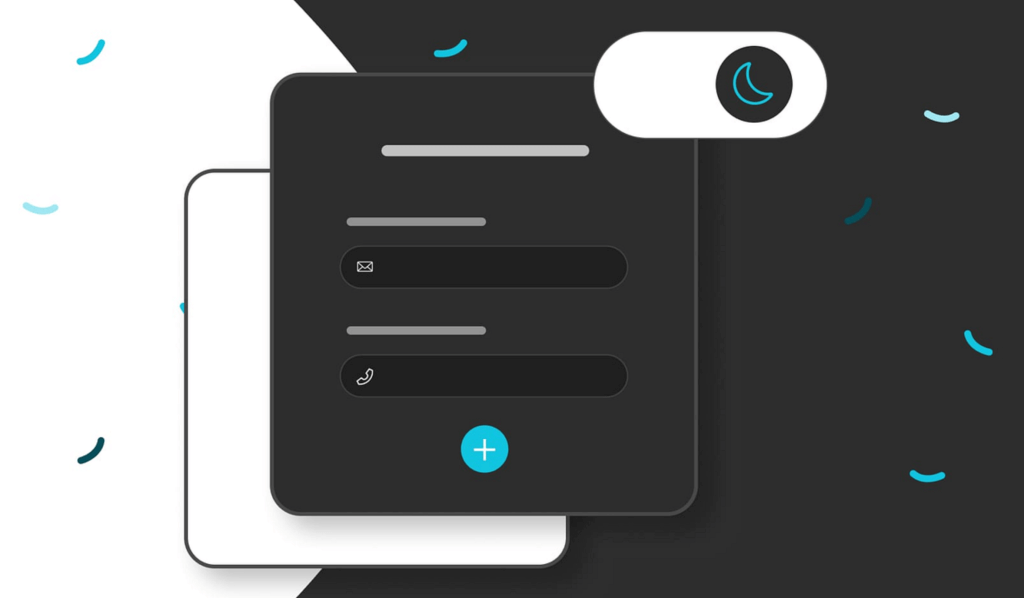
Dark Mode’s popularity stems from its psychological and practical benefits. It reduces eye strain and blue light exposure, enhancing comfort and focus, especially in low-light environments. Over 58% of designers prefer it for its modern appeal and deep blacks. However, it’s not always ideal for readability and can increase cognitive load in text-heavy applications. User interaction on platforms like Instagram rises by 15% with Dark Mode in website design, showing its effectiveness in fostering engagement. Preferences vary by age and task, but understanding these nuances can help optimize the user experience. Learn more about its impacts and best practices ahead.
User Preferences
When considering user preferences for Dark Mode, factors like individual comfort, ambient lighting, and specific tasks play essential roles. Research shows that 58.7% of designers prefer Dark Mode, citing its modern aesthetic and ability to provide deeper blacks on OLED screens, conserving battery life. However, this preference isn’t universal; a balance exists between users who favor Dark Mode and those who opt for Light Mode.
User satisfaction often hinges on context. For instance, Dark Mode is generally more comfortable in low-light environments, considerably reducing eye strain. Conversely, Light Mode tends to be preferred for reading extensive text, as it enhances readability and reduces cognitive load during prolonged use.
The task at hand also influences mode preference. Users frequently choose Dark Mode for immersive activities such as gaming and multimedia consumption, while Light Mode is favored for productivity tasks like writing and editing. This duality indicates that user satisfaction is closely linked to the interface’s adaptability to different conditions and activities.
Psychological Comfort
Many users find Dark Mode enhances psychological comfort by reducing eye strain in dimly lit environments. When you switch to dark mode, the contrast between the interface and the ambient light decreases, which can lower the strain on your eyes. This reduction in eye strain is essential for those who spend extended periods on their devices, making dark mode a preferred choice for a better user experience.
Data shows that user preference for dark mode is often tied to the psychological comfort it provides. The darker interface minimizes blue light exposure and evokes feelings of sophistication and modernity. This aesthetic appeal can positively influence your emotional response, making you more likely to engage with the application for longer periods.
Moreover, dark mode’s impact on reducing blue light exposure may improve sleep quality if you use screens during the evening. This benefit extends to your overall well-being, further enhancing psychological comfort. While user preferences can vary, the consistent feedback highlights that many individuals find dark mode more comfortable and less straining on the eyes, elevating their overall user experience.
Readability and Cognitive Load
While Dark Mode enhances psychological comfort by reducing eye strain, it can increase cognitive load due to the lower contrast between text and background, making it less favorable for prolonged reading tasks. When you choose Dark Mode, you might experience reduced readability, particularly if you’re engaged in activities requiring high visual acuity. This is essential for tasks requiring prolonged focus, like reading extensive texts or working on detailed projects.
Research indicates that although Dark Mode helps in dimly lit environments, it may not always be the best choice for everyone. Here are some key points to take into account:
- Reduced Contrast: The lower contrast between text and background in Dark Mode can make reading more challenging.
- Eye Fatigue: Users with visual conditions like presbyopia may experience increased eye strain.
- Visual Acuity: Tasks requiring high visual precision may suffer due to decreased clarity.
- Individual Variability: The effectiveness of reducing eye strain varies among users.
- Reading Comprehension: Light mode generally enhances readability and comprehension for extensive text.
Innovative design must balance these factors to enhance user experience. Your choice between Dark Mode and Light Mode should be guided by personal comfort and the specific demands of your tasks.
Aesthetic Appeal
Dark Mode’s aesthetic appeal lies in its ability to convey a sense of modernity and sophistication, greatly enhancing user satisfaction and engagement. This aesthetic choice is not merely superficial; it taps into the aesthetic-usability effect, where visually appealing designs are perceived as more user-friendly. When you opt for dark mode, you’re making a choice that can trigger a positive emotional response, fostering a deeper connection with the interface.
Data underscores the popularity of dark mode among users, especially in creative and tech-oriented applications. For instance, platforms like Facebook and Instagram have reported a 15% increase in user interaction when dark mode is available. This spike in user engagement demonstrates that dark mode can greatly enhance the overall user experience, making it more immersive and enjoyable.
Moreover, attractive interfaces, including dark mode options, contribute to positive emotional experiences. This, in turn, fosters increased loyalty and repeated application use. When you find an interface visually pleasing, you’re more likely to spend time on it, increasing user satisfaction and engagement. With its contemporary and sophisticated vibe, Dark Mode successfully leverages these factors to create a compelling user experience.
Visual Acuity Impact
Dark mode can increase cognitive load due to the lower contrast between text and background, potentially making it less suitable for tasks requiring prolonged reading or high visual precision. When readability is essential, the decreased contrast in dark mode can lead to higher eye strain, especially for users with visual conditions like farsightedness or presbyopia. You might find that white text on a dark background causes your pupils to dilate, resulting in blurry vision and greater eye fatigue in low-light environments.
Consider these points:
- Contrast: Dark mode’s reduced contrast can hinder readability and comprehension.
- Eye Strain: Users with visual conditions may experience increased eye strain.
- Pupil Dilation: White text on a dark background can lead to blurry vision.
- Readability: Light mode generally offers better readability for extensive text.
- Individual Variability: The effectiveness of dark mode varies, with some finding comfort in light mode, especially in bright settings.
Despite its aesthetic appeal, dark mode’s impact on visual acuity highlights the need for a balanced approach. By understanding the nuances of how dark mode affects visual conditions and readability, you can make more informed decisions to enhance your user experience.
Implementation Challenges
Implementing dark mode presents a significant challenge of ensuring all text and UI elements remain readable while maintaining sufficient contrast. You must carefully balance colors to enhance usability and visual comfort without sacrificing readability, especially for visually impaired users. Accessibility becomes a critical concern, as inadequate contrast can make it difficult for some users to interact with your application effectively.
User feedback is invaluable in overcoming these implementation challenges. For instance, Slack integrated dark mode in response to user demand for reduced eye strain during prolonged use. This feedback loop helps you refine dark mode, ensuring it meets users’ needs and preferences.
Additionally, flexibility in interface settings is essential. Allowing users to customize contrast levels and other display preferences can address individual visual conditions, further enhancing usability. You should create an interface that balances aesthetic appeal with functional requirements, which can lead to higher user engagement and satisfaction.
Incorporating dark mode thoughtfully can transform user experience, but addressing these challenges is critical to fully realizing its benefits. By focusing on accessibility and leveraging user feedback, you can create a dark mode that offers visual comfort and usability.
Best Practices
To maximize the benefits of dark mode, prioritize maintaining high readability and contrast to enhance user experience and minimize cognitive strain. Dark mode can greatly improve usability if executed correctly, but balancing aesthetic allure with functional necessity is essential. Here are some best practices to follow:
- Ensure High Contrast: Use high-contrast color schemes to make text and interface elements stand out, reducing cognitive load.
- Consider Context of Use: Tailor dark mode for applications that involve extended reading or frequent interaction, such as messaging or news apps.
- Provide Flexibility: Allow users to switch between dark and light modes to suit their personal comfort and varying lighting conditions, enhancing overall usability.
- Cater to Individual Needs: Account for users with specific visual conditions who might find white text on dark backgrounds uncomfortable, ensuring accessibility.
Balance Aesthetics and Functionality:** While dark mode should look modern and sophisticated, it should never compromise usability or accessibility.
Conclusion
In embracing Dark Mode, you tap into a sophisticated digital experience akin to the serene ambiance of a dimly lit library. This choice isn’t just about aesthetics; it’s rooted in data highlighting reduced eye strain and improved focus. Understanding your preferences’ psychology makes you better able to navigate your digital world comfortably. As brands recognize these insights, expect more refined interfaces that cater to your visual and cognitive needs, enhancing your overall experience.